
BRIEF
One Day is the alumni magazine of Teach For America. It publishes reporting and commentary on critical issues education and on the evolving work of Teach For America’s alumni and corps members. The mission is to provide the information, perspective, and inspiration that our readers need to actively engage in the movement for educational equity and excellence.

SOLUTION
Reorganize the Information Architecture and design a more intuitive and engaging page layouts with digital bonus. Users will be more interested to read and share as well as connected to the community.
CHALLENGE
Redesign One Day’s website to be a stand-alone online magazine experience which encourage the users to interact and share articles with their network. The goal is to strengthen the TFA Alumni community and inspire them to achieve collective impact.

TEAM
Director
of
Digital Product

UX Designer
UX Designer
ME!
TIMEFRAME
Case Study
Project Overview


DISCOVERY
USER
RESEARCH
Based on our user research with 27 responses from online survey and 6 phone interviews, I was able to find the patterns and users’ reading behaviors. We created three personas that represent different user journey to guide our design decisions.
DESIGN
RESEARCH
I did some research by identifying similar online publications and analyzing characteristics like discoverability and page layouts, as well as multimedia elements. From those sites, I learned the pain points and avoid designing in that way; I found inspirations and transformed into more intuitive and delightful designs.


IDEATION
WHITE-
BOARDING
From all the information and insights we gathered from research, we sketched out ideas such as banner designs, page layouts, buttons placement, interactive elements, etc on whiteboard. We were able to change things very quickly and developed in many different ways to see what works the best.
PAPER
PROTOTYPE
In order to save time making changes on digitalized design, we conducted usability testing on our paper prototype. We were able to adjust anything before moving too far.


TEST
USABILITY
TESTING
We tested with 5 people on both current website and our paper prototype. In order to gain real data and propose our new design to our client, we recorded how users experienced difficulty in their current site with video, also showing how we can improve with our design. Although it wasn't easy and had spent a lot of time, the feedback was very helpful and informative.
ITERATION
The redesign of One Day Magazine provides a more intuitive site, and users are more engaged with the interactive buttons we added. However, there are still minor problems that may confuse the users, so we kept iterating and improving.

Final Product

PROTOTYPING


Iterating on key screen and wireframe layouts helped inform us on how users will interact with the content. The last step is to connect every screen and create interaction design. In order to present a realistic prototype to our client so he can fully understand our design, I chose to deliver this project with visual/motion aid.
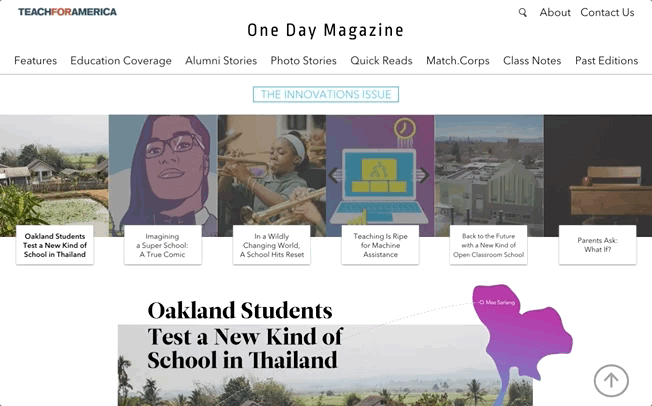
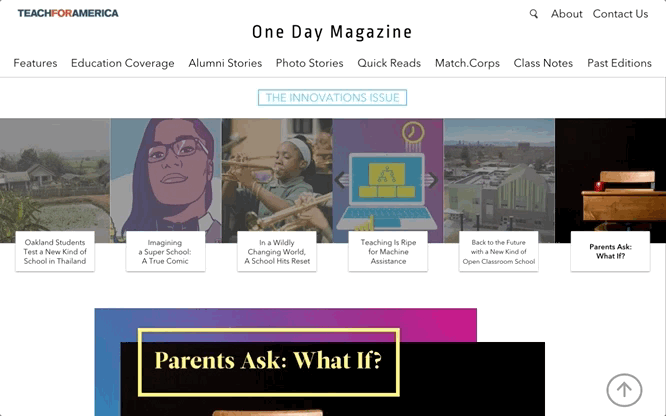
The first thing that users will see is a carousel of features from the latest edition. With these trendy banners, it catches the users’ eyes when they enter the site.
With collage style, we showcase the latest articles that are not features, and articles from different sections.
A short preview of the latest video is shown next so that users will have better discoverability of the site’s video content.
Bottom part presents “Match.Corps” and “Class Notes” with brief description. Users who are new to Teach for America can get an idea of the two unique sections.


PREVIOUS DESIGN


HOMEPAGE
MULTIMEDIA ELEMENT
The banner on the top represents that these features are from same package/edition. Users will be able to go to another feature article by clicking on the boxes.
Using different layouts or effects for images such as parallax and collage gives the users a delightful reading experience.
Adding audio clips, hidden info. boxes makes the article more interactive and immersive, so the users will be more engaging and enjoyed.
PREVIOUS DESIGN


For those lengthy article, adding anchor and sticky menu bar for each section will save the users’ time instead of scrolling through the entire article.
PREVIOUS DESIGN


ANCHOR
ARTICLE BOTTOM
Reaction poll and contact button are added to increase user’s engagement and connection to the community.
PREVIOUS DESIGN


CLASS NOTES
By adding reaction buttons, this can increase the interactions and strengthen the connection between the alumni.

PREVIOUS DESIGN


